

User experience without barriers
A website that works logically brings in more enquiries. We remove the barriers where your visitors drop off now.





Quality work in Arnhem and surroundings, with a fixed price up front.
Request a free quote★★★★★ Google reviews100+ businesses and growing












Marketingkenners verbetert de gebruikerservaring van websites van vakbedrijven, zodat meer bezoekers een offerte aanvragen. We starten met een nulmeting, zoeken met heatmaps, sessie-opnames en Google Analytics waar bezoekers vastlopen en voeren de verbeteringen zelf door. Daarna meten we het effect in aanvragen en toetsen we grote keuzes met een A/B-test als het verkeer dat toelaat.
What is user experience?
User experience, or UX, is how easy and pleasant it is for someone to use your website. Does a visitor quickly find what they are looking for? Do they immediately understand what you do and how to request a quote? Then the user experience is good.
With a poor experience, the visitor searches for a phone number, struggles with a long form or doesn’t know whether you work in their area. Then they click through to the next tradesperson on Google.
Improving user experience is therefore a fixed part of conversion optimisation. The goal is not a prettier site, but more enquiries.

Two versions, one winner
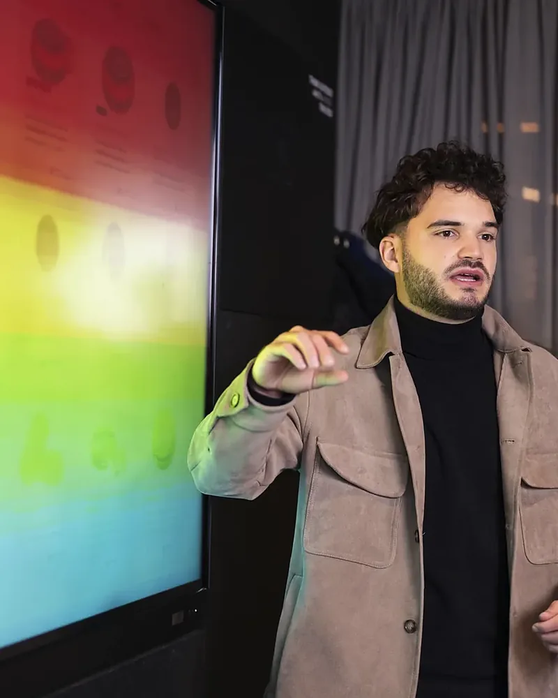
We change one thing at a time and measure what delivers more enquiries. Switch between the original, the variant and the heatmap.
The original: a generic button and a long form. Visitors drop off before they send anything.
Do you recognise this on your own site?
Your menu is a maze
Ten menu items and three submenus. The customer is just looking for whether you install dormers.
On mobile everything falls apart
Buttons too small, text too long, photos that don’t load. While most visitors search on their phone.
Your service area is nowhere to be found
A visitor from Velp wants to know whether you cover their area. If it doesn’t say, they call someone else.
The form asks too much
Address, year built, measurements and a photo, before there has even been contact. Many people drop off then.
Nobody knows what happens next
No confirmation after sending and no idea when you will call back. That feels uncertain.
Your best work is hidden
Great projects and good reviews, but somewhere on a separate page that almost nobody visits.
What a better user experience delivers
Say your site attracts 2,000 visitors a month and 1.5% request a quote. That is 30 enquiries. Improve the experience so that 2.5% get in touch, and you get 50. Twenty extra enquiries a month, from the same traffic.
If you want to get those same 20 enquiries with more visitors, you need 1,300+ extra visitors a month. That costs advertising budget or months of SEO. A better user experience therefore often pays for itself faster.
It is a worked example, not a promise. How much there is to gain for you only becomes clear after a baseline with good tracking.
How a good tradesperson’s site feels
This is what we test every site against.
- At the top it says what you do and where you work
- The site loads fast, even on a phone
- You can call or request a quote from every page
- Reviews and project photos are straight in view
- The form only asks what is needed
- After the enquiry, the customer knows what happens

Baseline
We measure how many enquiries your site brings in now and through which pages. That is the starting point we are held to.
Research
With heatmaps, session recordings and your figures from Google Analytics, we look for where visitors get stuck.
Improve
Our designers and developers make the improvements themselves, from a shorter route to your form to a faster mobile site.
Measure and test
We look at what it delivers in enquiries. Where traffic allows, we test big choices with an A/B test.
A nice-looking website or a website that works
A nice-looking website
- Built on taste
- Lots of effects and big images
- Contact is at the bottom or in the menu
- Done is done after launch
A website that works
- Built on what visitors do
- Fast and clear, on mobile too
- Contact is always one click away
- Keeps improving based on numbers
Frequently asked questions
Don't see your question here? Call, WhatsApp or email us. You'll get an answer within one working day.

What is the difference between UX and conversion optimisation?
UX is about how easy and pleasant your site is to use. Conversion optimisation is about how many visitors ultimately make an enquiry. A better UX is usually the fastest route to a higher conversion rate, so the two go together.
Does my website need to be rebuilt?
Usually not. Plenty of the gain sits in small changes, such as a shorter route to the form or a call button that is always in view. If the foundation is too slow or outdated, we discuss a new website that brings in enquiries.
What do you need from me to get started?
Access to your website and to Google Analytics, if you have it. If good measurement is missing, we set that up first. We also want to know which jobs you most like to win, because we tune the site to that.
How quickly will I notice the difference?
We often fix clear barriers in the first weeks, and you soon see the effect in your enquiries. Bigger changes we measure over a longer period. In the monthly meeting you see what each improvement delivered.
Why do many agencies pay little attention to this?
Many agencies focus mainly on more visitors, because that is easy to show. But visitors who don’t get in touch bring you nothing. We steer on quote requests and signed jobs, and good user experience is part of that.
Where do your visitors drop off?
A specialist looks with you for 30 minutes at where your site is leaking. Free, over video.
 Marketingkennersonline · reply within one working day